The Cosy Kiln
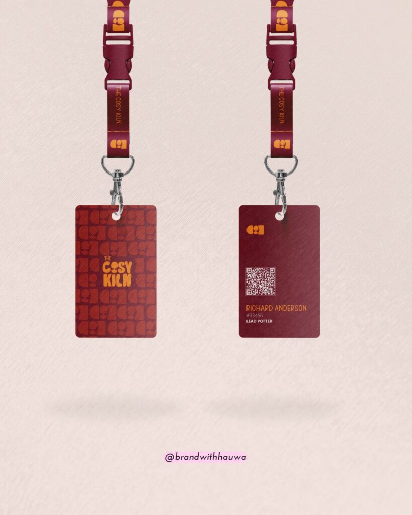
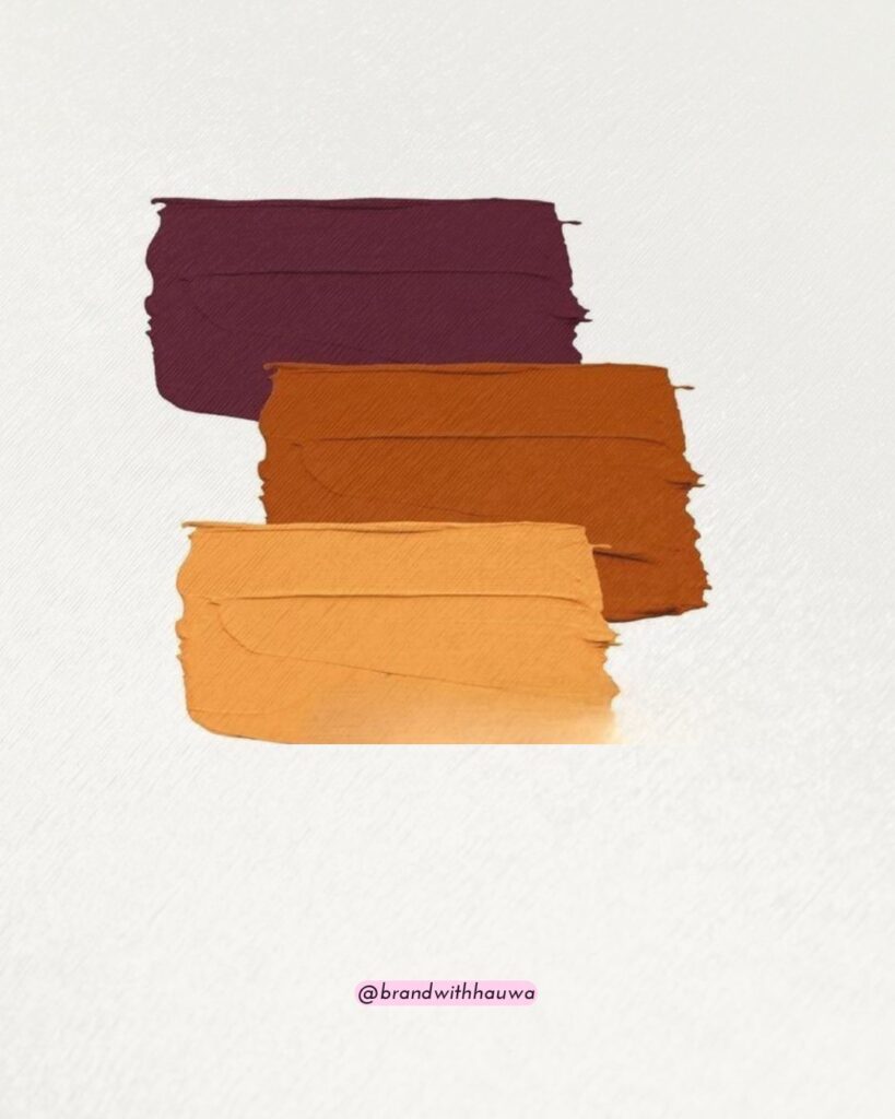
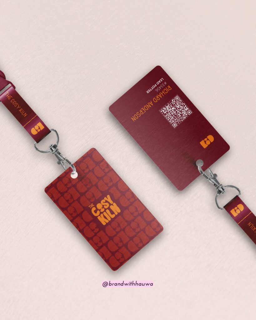
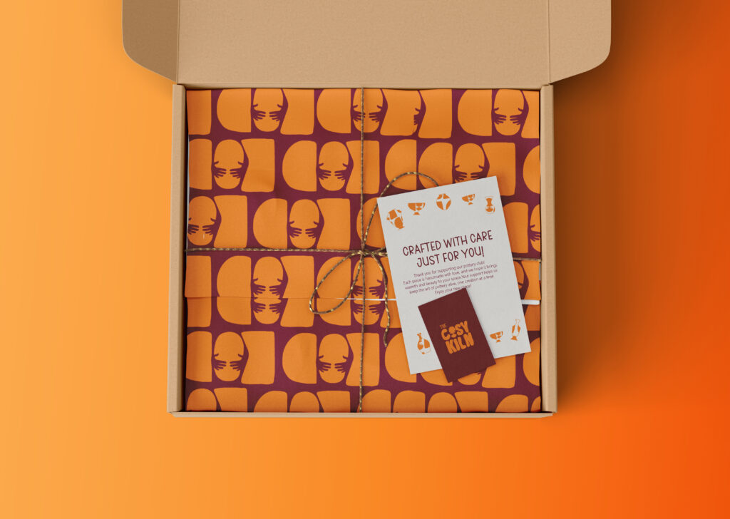
This pottery membership club isn't polished and pristine, it's grounded, raw, and full of soul. So I leaned into a color palette that mirrors that energy: burnt orange, mustard, and maroon, bold yet earthy tones that echo the natural hues of clay, fire, and creativity.
The Process
For The Cosy Kiln, I wanted the brand to feel like it was shaped from the same clay that lives under your fingernails after hours at the wheel, warm, imperfect, and deeply human.
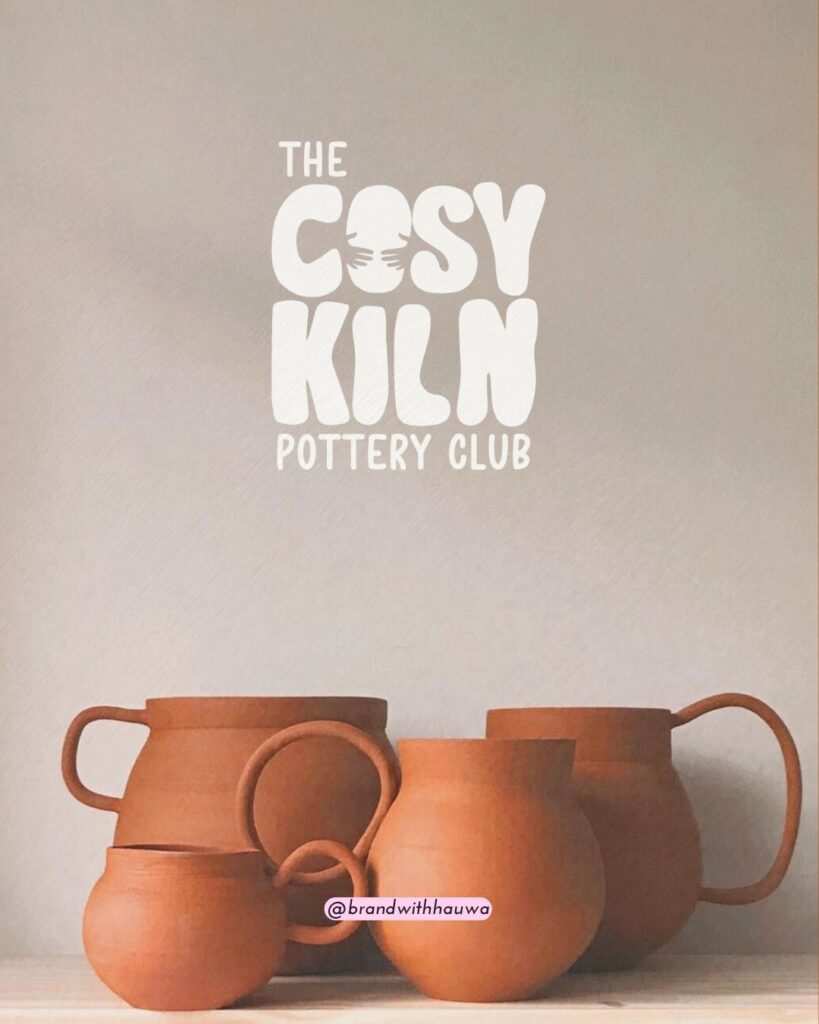
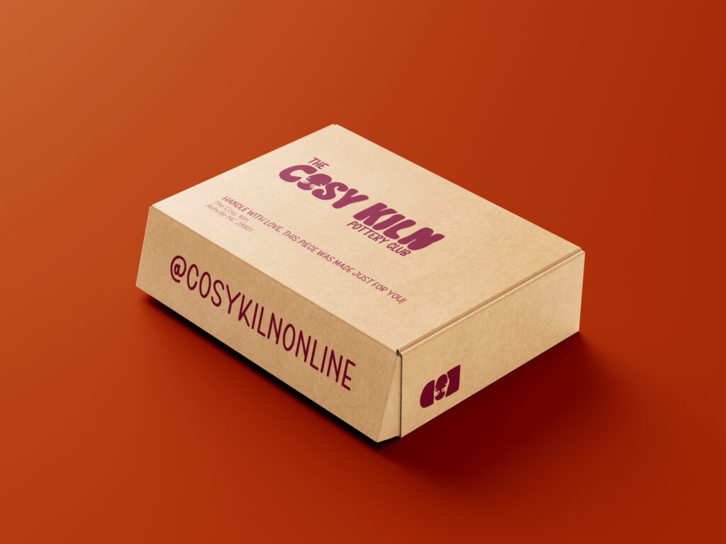
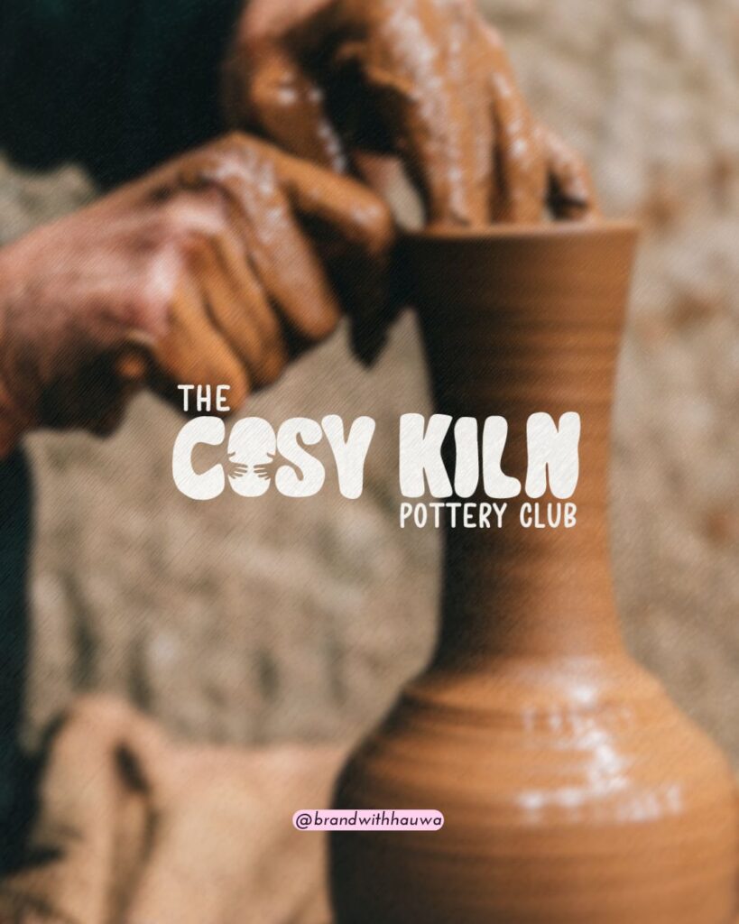
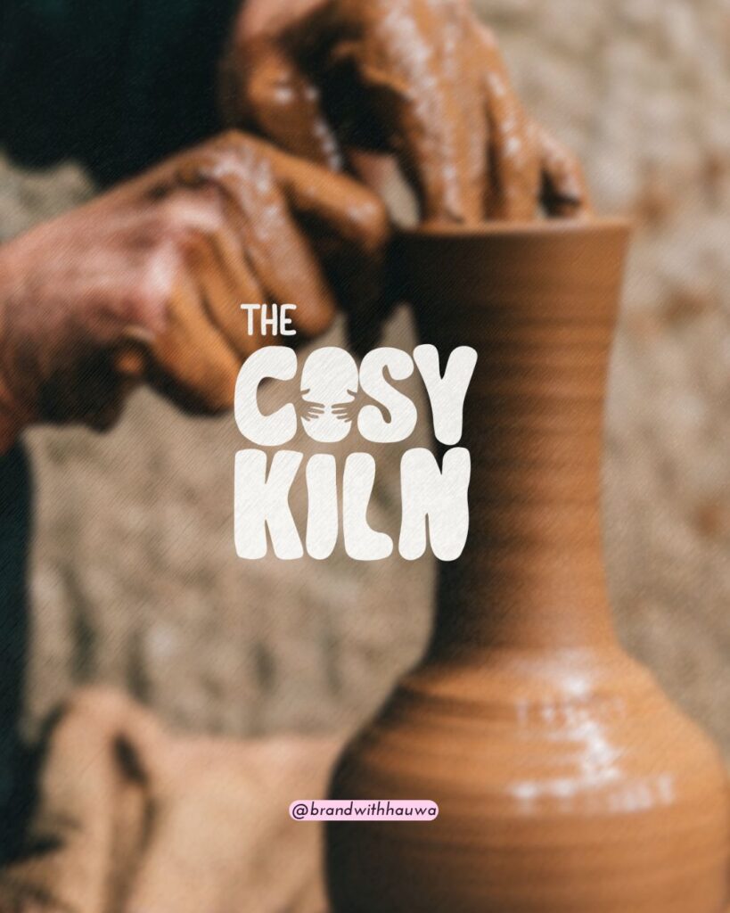
Think of the logo like it was moulded, not drawn. Each letter feels handmade, especially the "O" — cradled by a pair of illustrated hands on either side, as though someone's mid creation behind it. It’s subtle, but it tells a story of care and craft.
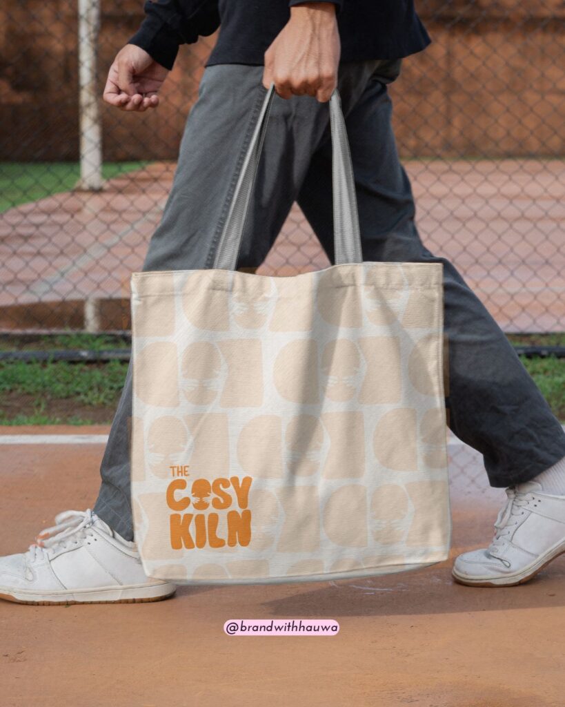
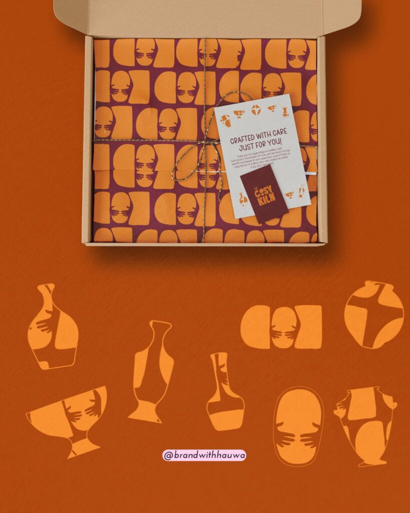
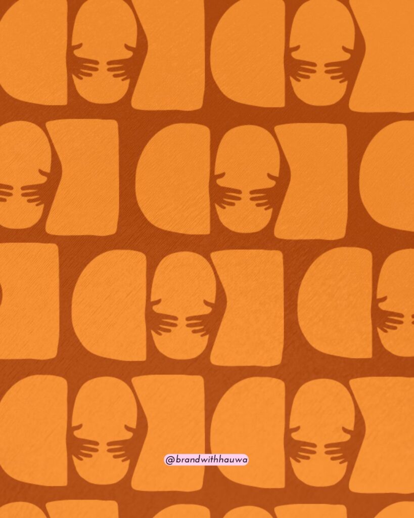
The brand icon is built from the initials COK shaped like soft silhouettes, without letter cutouts. Just form. Just clay. When repeated, they create a raw, rhythmic pattern that feels tactile, like fingers pressing into soft earth.
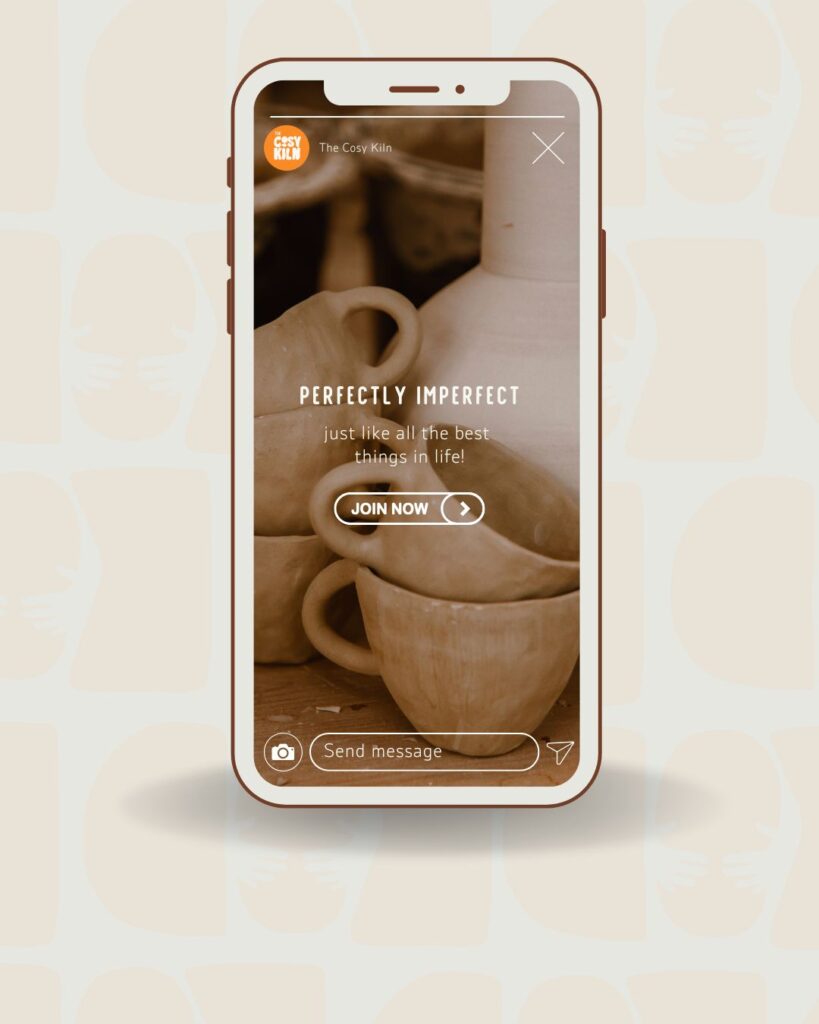
Every element was crafted to celebrate the joy of handmade things, imperfect and beautiful, just like the pieces made inside The Cosy Kiln.
“Hauwa surpassed our expectations. Everyone on the team was happy with the deliverables.”
Roy JManager


