Bloomé Skincare
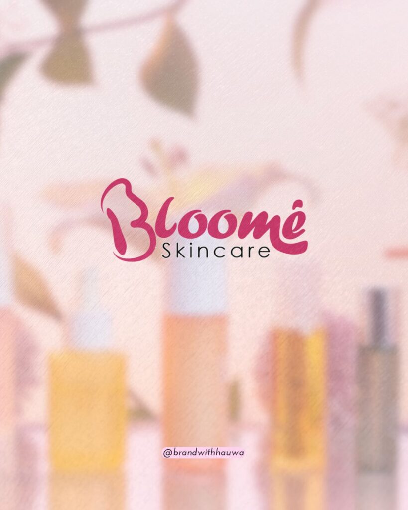
Designing Bloomé Skincare was all about capturing the essence of transformation. How skin, like a flower, blooms with the right care. 🌸✨
The Process
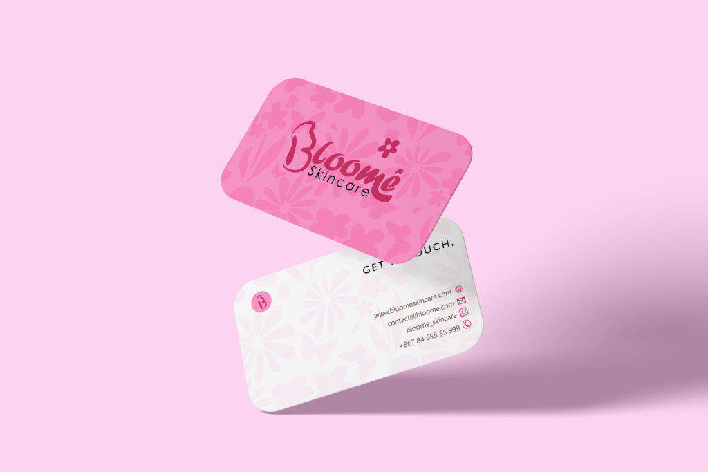
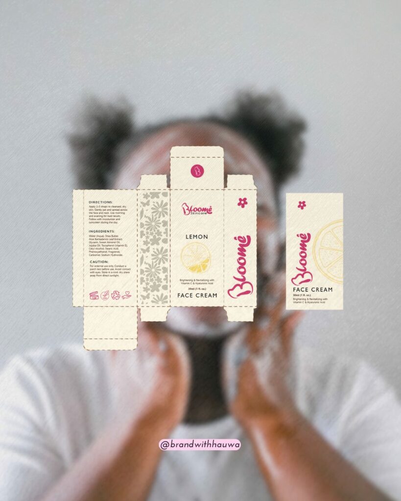
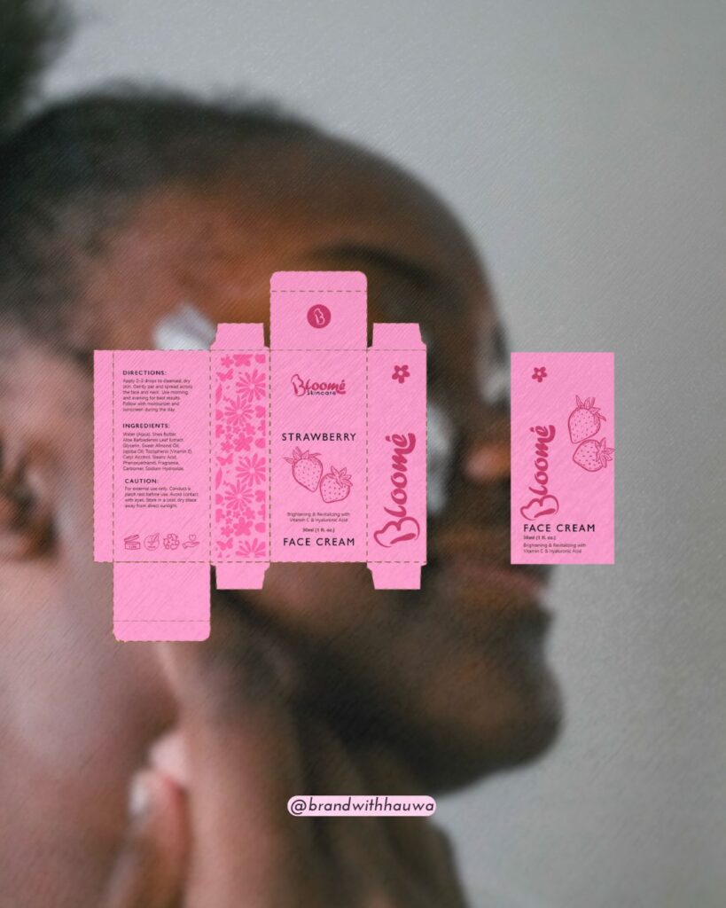
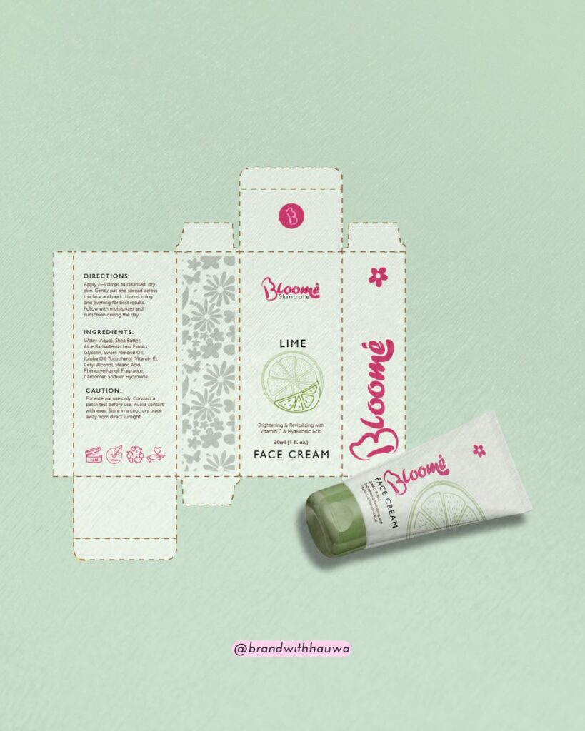
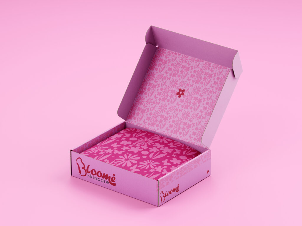
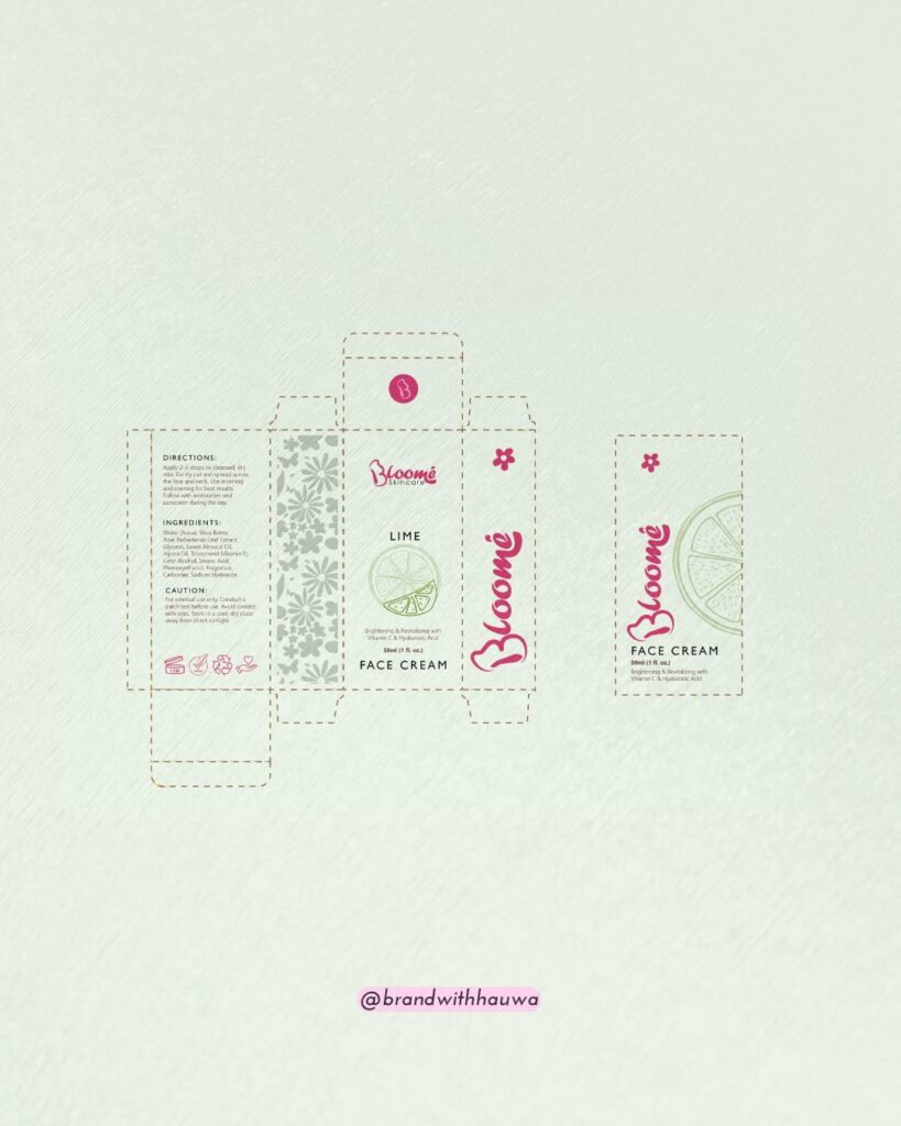
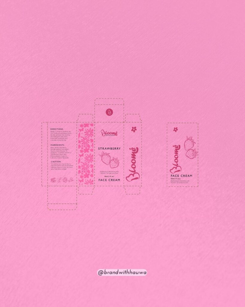
For Bloome Skincare, I wanted the brand to feel soft, organic, and effortlessly elegant, just like the experience of blooming itself. The brand pattern is a monochrome floral composition, a delicate balance of structure and fluidity. This box package design shows off the brand pattern. I wanted the design to feel seamless, natural, and rooted in the brand’s core essence: growth, beauty, and transformation.
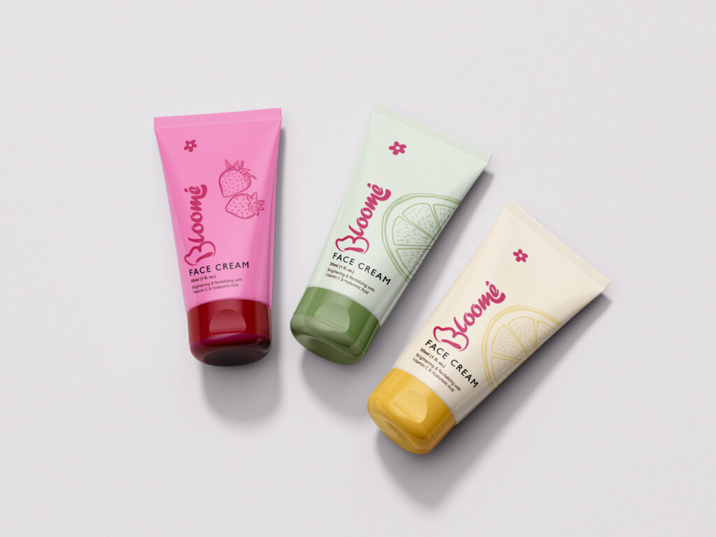
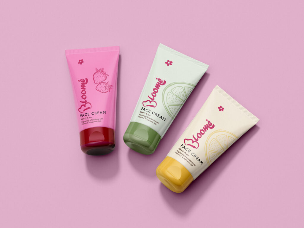
The custom typography stretches and curves subtly, mimicking the organic flow of petals unfurling. It’s soft yet confident, a balance of elegance and vitality. The deep pink, bordering on burgundy, grounds the brand with warmth and richness, while pastel shades of mint, yellow, and pink create a delicate contrast. Like a fresh bloom against soft morning light.
But here’s my favorite detail, the 'B' isn’t just a letter. It’s a butterfly in side profile, a nod to how blooming flowers attract beauty, life, and movement. It’s a fresh take on floral skincare branding, shifting from the obvious petals to the things they invite.
Every element was intentional, from the colors to the curves, because great design isn’t just seen, it’s felt. 💖
“Hauwa completely brought Bloome skincare to life!”
Miss OmiCommunity Manager


