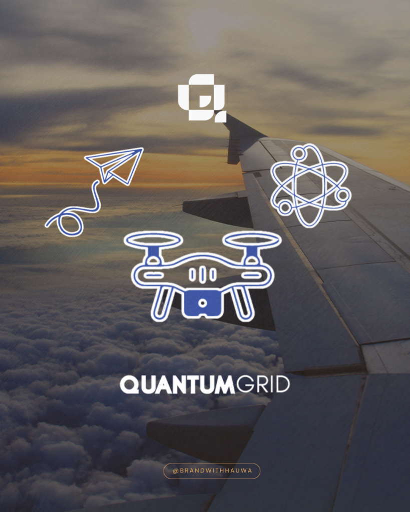
QuantumGrid
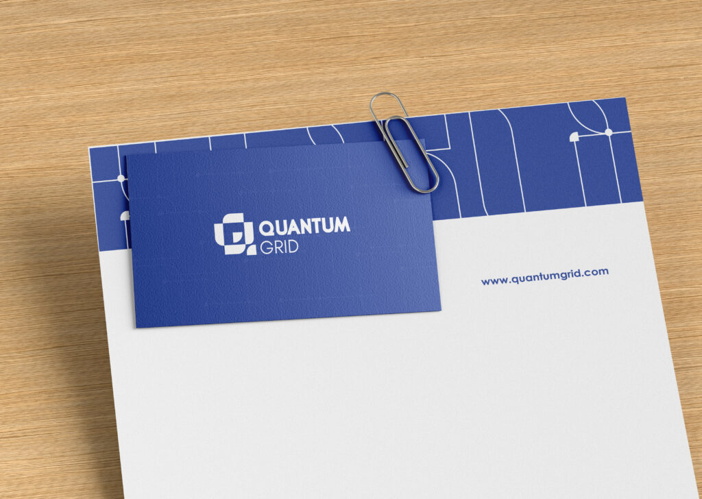
The entire identity had to feel futuristic, but not cold. I leaned into clean lines, a structured grid, and a deep blue color to strike the balance between tech driven and trustworthy. Every design choice was intentional, created to mirror the kind of seamless, intelligent systems Quantum Grid builds in the real world.
The Process
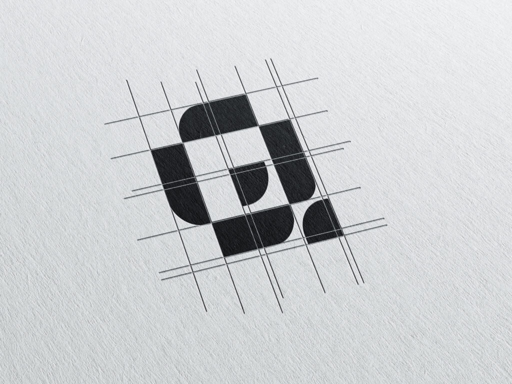
Designing Quantum Grid was one of those projects that stretched and excited me at the same time. From the very beginning, I knew this brand needed to feel intelligent, futuristic, and sharp. Something that reflects its roots in aerospace innovation, AI, and cutting-edge drone tech. I started with the logo, building it around movement and systems. The arrow like forms going in opposite diagonal directions represented multidirectional growth, navigation, and the seamless flow of information, an idea that’s central to what Quantum Grid does.
Once the core logo was set, I began pulling elements from it to create a deeper visual language. The icon was extracted from the logomark, kept minimal and bold for versatility. For the brand pattern, I used the shape from the logo to create a repeating system of paths and intersections, placing a circle at every meeting point to represent nodes, hubs of connection, data, or direction. It’s a subtle nod to the idea of networked intelligence and system optimization.
“This is my second time working with Hauwa for brand design and she delivers every time. It has been a pleasure working with her.”
Mr JefferyCo-Founder of QuantumGrid


